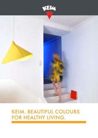
Colour psychology

The psychological effect of colour
Colours have a psychological effect on people by triggering moods and emotions. They can have a calming or stimulating effect, foster concentration or give us orientation. Every colour has a different effect, because every shade has its own wavelength and energy that are transferred to our bodies, our thoughts, feelings and actions. According to colour psychologists in the field of colour psychology, the individual perception of colour depends on our specific culture, experience, mindset and instincts, as well as the "archetype" in us.
In chromo (colour) therapy for example, the effect of colour is used in colour baths, colour acupuncture or colour irradiation in order to have positive effects on our health.


Primary colours and their symbolic meaning
Colour psychology refers to between four and six colours as so-called "base colours" according to the European colour system. In addition to black and white as the achromatic colours, the base colours also include the chromatic colours red, yellow, green and blue. Colours differ in symbolic meaning and significance from one culture to the next.
Red
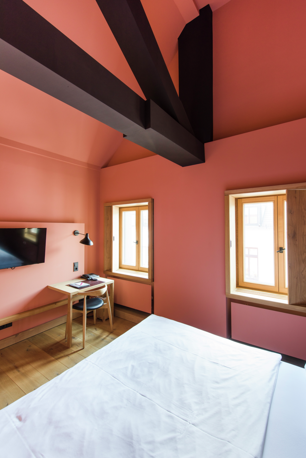
Red has a meaning in every culture. In colour theory it stands for energy, love, fire, power and sensuality. Depending on intensity and context, red can also be perceived as "aggressive". In nature, red stands for both warning and attraction. According to colour psychology, it has a stimulating, dominant effect; it enhances self-esteem and gives vitality.


Green
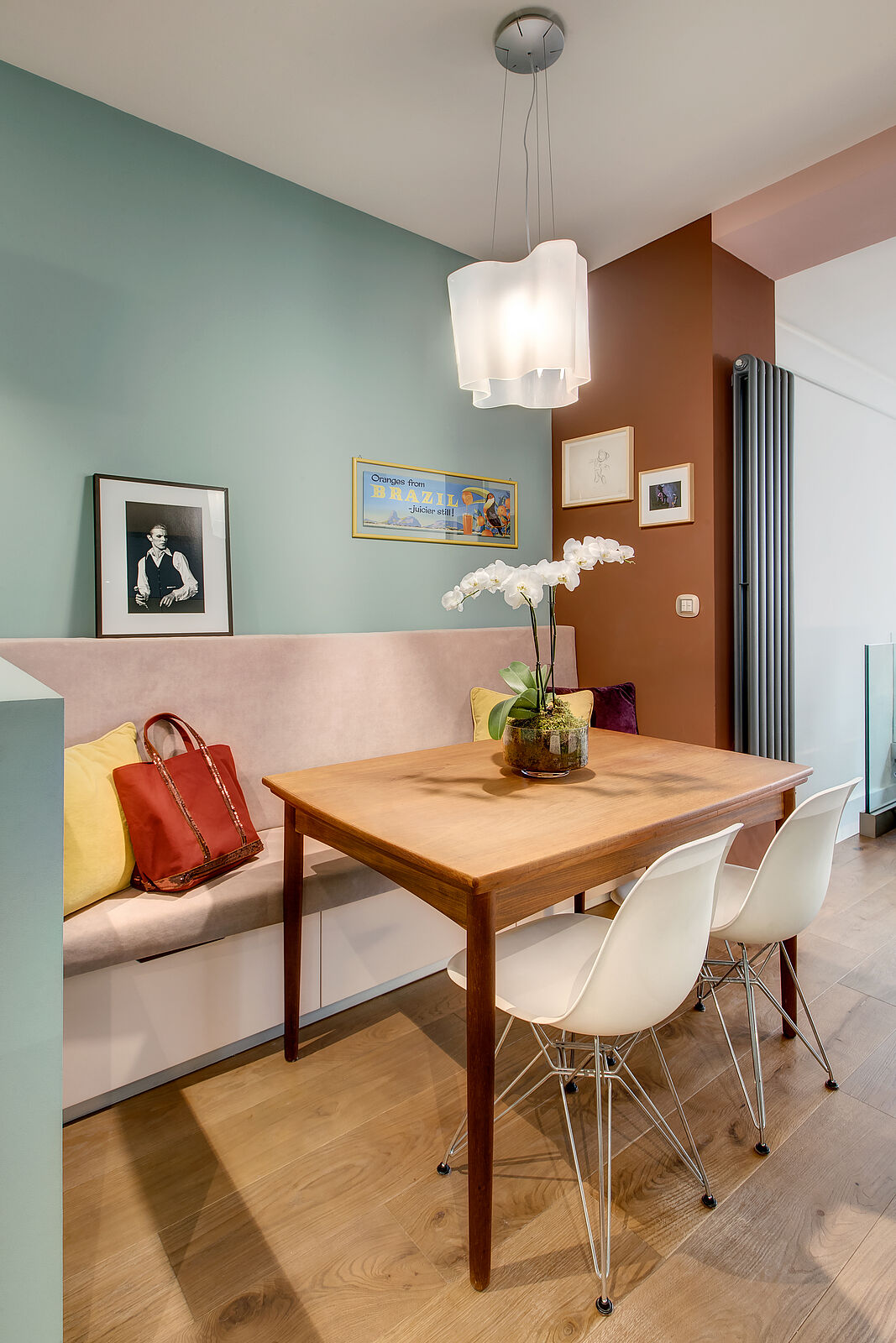
People see green as a symbol of life, nature and naturalness. We frequently associate green with luck, hope and contentment. Green has a recuperative, balancing effect on the psyche, it is said to harmonise body and soul. As the colour of nature, green is particularly relaxing to the human eye.

Yellow
Already Goethe's colour theory says that yellow has "a bright, cheerful, softly exciting character". On the psychological level, yellow has a stimulating effect on people and is said to promote sharing and interpersonal communication. Yellow is very effective particularly in the dark and is therefore also used as a warning colour (e.g. yellow hi-vis vests, taxis).

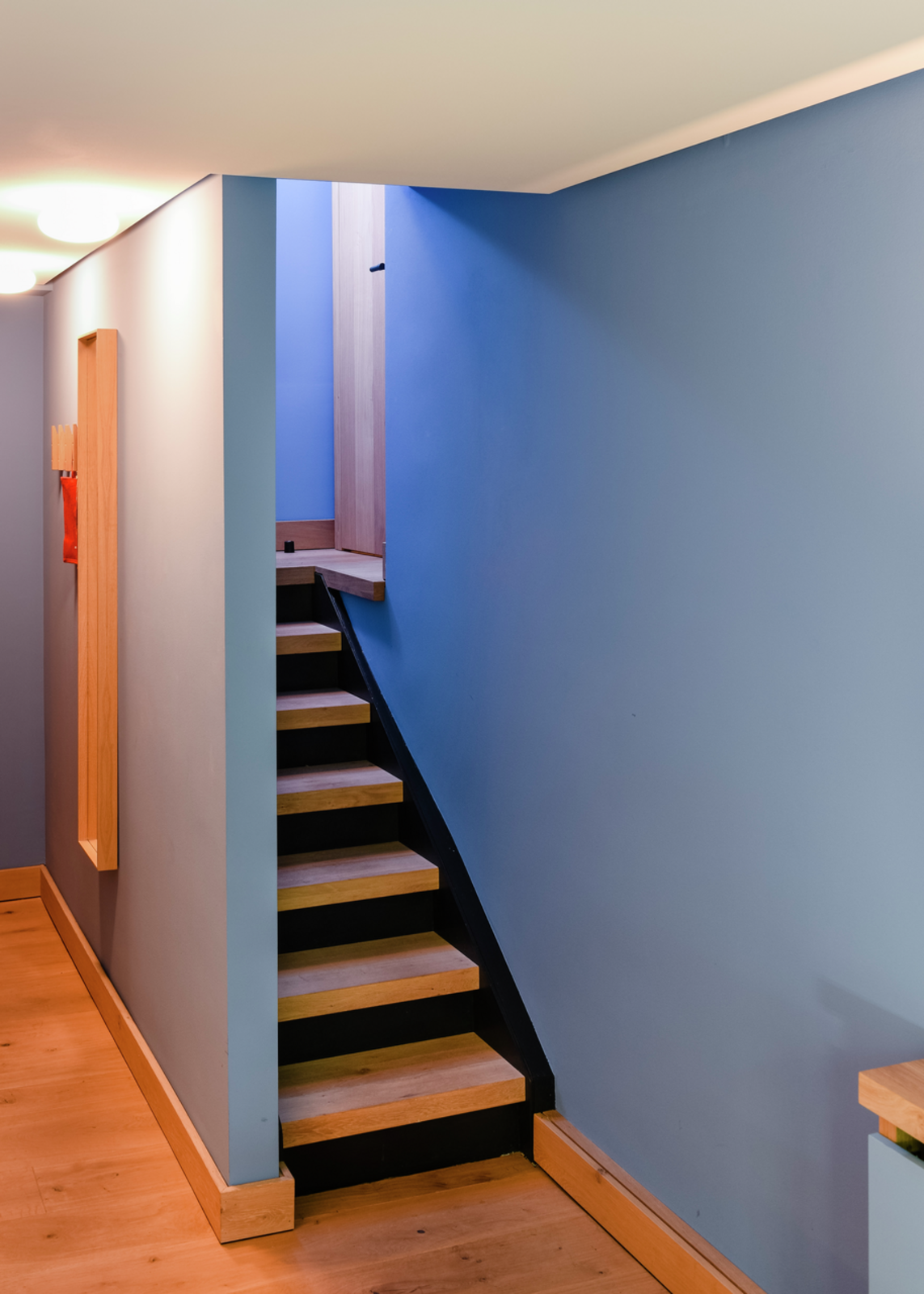
Blue
As a symbol colour, blue stands for trust, harmony and constancy and is often associated with calm and concentration. Blue is also the most popular colour in Germany as it implies objectivity and reticence. In psychological terms, blue has a relaxing effect: it alleviates stress and is said to stimulate the unconscious mind and people’s own intuition.

Black, white and grey: what is the effect of achromatic colours?
Colour psychology refers to colours as "achromatic" if they have neither a certain colour shade nor saturation. They differ from each other solely in terms of their brightness value. The degree of brightness results in greyscales. These include black, white and all grey shades.
Black
Black is a "non-colour" because it absorbs all the frequencies of light. Black divides people's opinions and can have different effects and trigger different emotions, depending on the culture. Black stands for darkness and grief, but also for sophistication, seriousness and discipline. Depending on the context, black can appear elegant, sublime and timeless and make a very bright colour look more elegant.
White
White symbolises peace, clarity, purity and innocence. In physical terms, the light spectrum of white consists of many different colours in a colour range. It is therefore often associated with divinity and perfection. Western cultures have no negative associations with white. But in China, white has another significance, where it is the colour of grief and death. White can therefore also stand for new beginnings and rebirth, as every beginning is as white as a blank sheet of paper.
Grey
Grey is the colour of objectivity, neutrality and reticence and is often associated with boredom and insecurity. Grey appears distinguished, subtle and purist; in combination with other colours, it can also be elegant. Grey can make other colours appear brighter and is therefore an ideal combination colour.

Colours seem to be warm and cold, loud and quiet
Cold colours
The colour temperature also affects the psyche. For example, the colours green, blue and violet (also known as purple) suggest a cooler room temperature. They enable us to focus better and usually have a calming effect. Cold colours in cool shades have a high share of blue in their colour composition. Blue, red and yellow are so-called "primary colours". They are used to make many other colours. For example, violet (or purple) is made of a cool, calming blue and a warm, stimulating red. Violet is often used in the creative context as this unusual colour is a synonym for extravagance, inspiration and spirituality.
Warm interior colours
Classic colour theory puts yellow, red and orange next to each other in the colour circle with a warmer colour temperature. Warm colours generally stand for energy, cheerfulness and happiness. But they can also attract attention and act as a symbol for danger (e.g. stop signs, warnings and barrier tape). Orange is a secondary colour and is a mixture of the two primary colours red and yellow. Orange represents warmth and light and stands for gaiety, optimism and youthful curiosity.
Colours act loudly and quietly
Besides the hot/cold effect, colours can also have a loud/quiet effect. A loud colour effect is created by highly saturated colour shades that are also combined with black or white. Quiet colour combinations are pastel shades with a low saturation level. As a general rule, it is advisable to use cold and warm and quiet and loud colours in the correct ratio.

Colour trends 2024
- KEIM Avantgarde 247
- KEIM Avantgarde 248
- KEIM Avantgarde 32
- KEIM Avantgarde 41
- KEIM Exclusive 9176
- KEIM Exclusive 9271
- KEIM Exclusive 9432
- KEIM Exclusive 9494