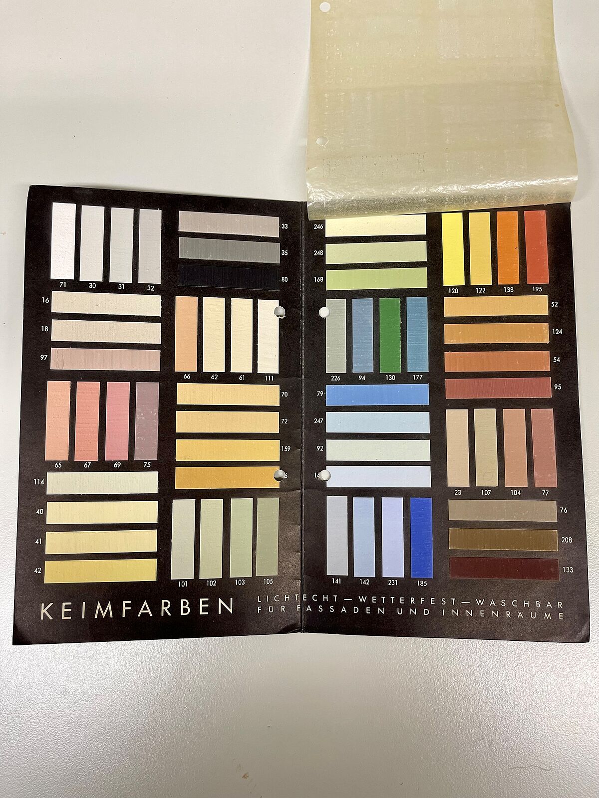
KEIM colour cards examined in detail

Characteristics:
- Company colour cards/color collections with a focus on historical and modern facade design
- Colour selection depends from binder
- Numbering of the colours with 2-5 digit numbers, deliberately without reference to a colour system
- Approx. 400 shades in KEIM colour cards, 63 shades in polyChro (Le Corbusier polychromy)
Author: Joachim Propfe, www.kalligrafie-propfe.de
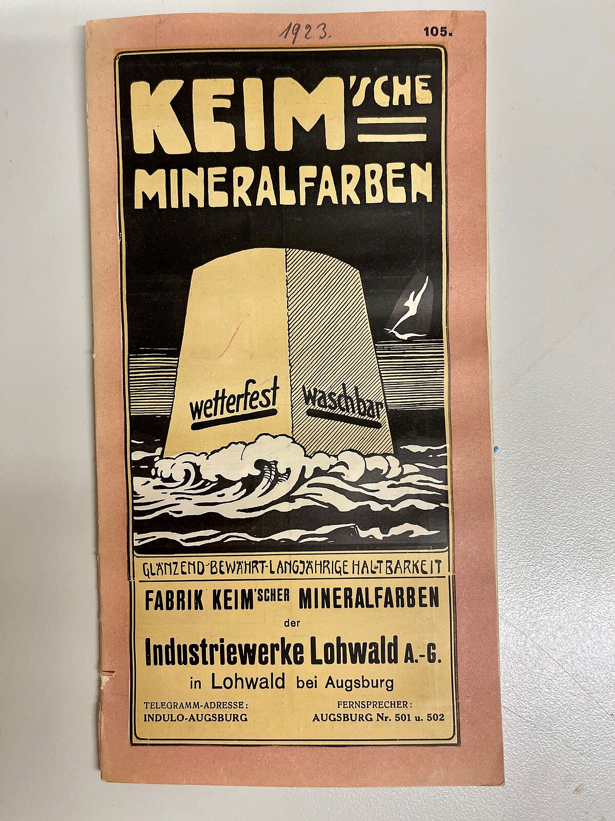
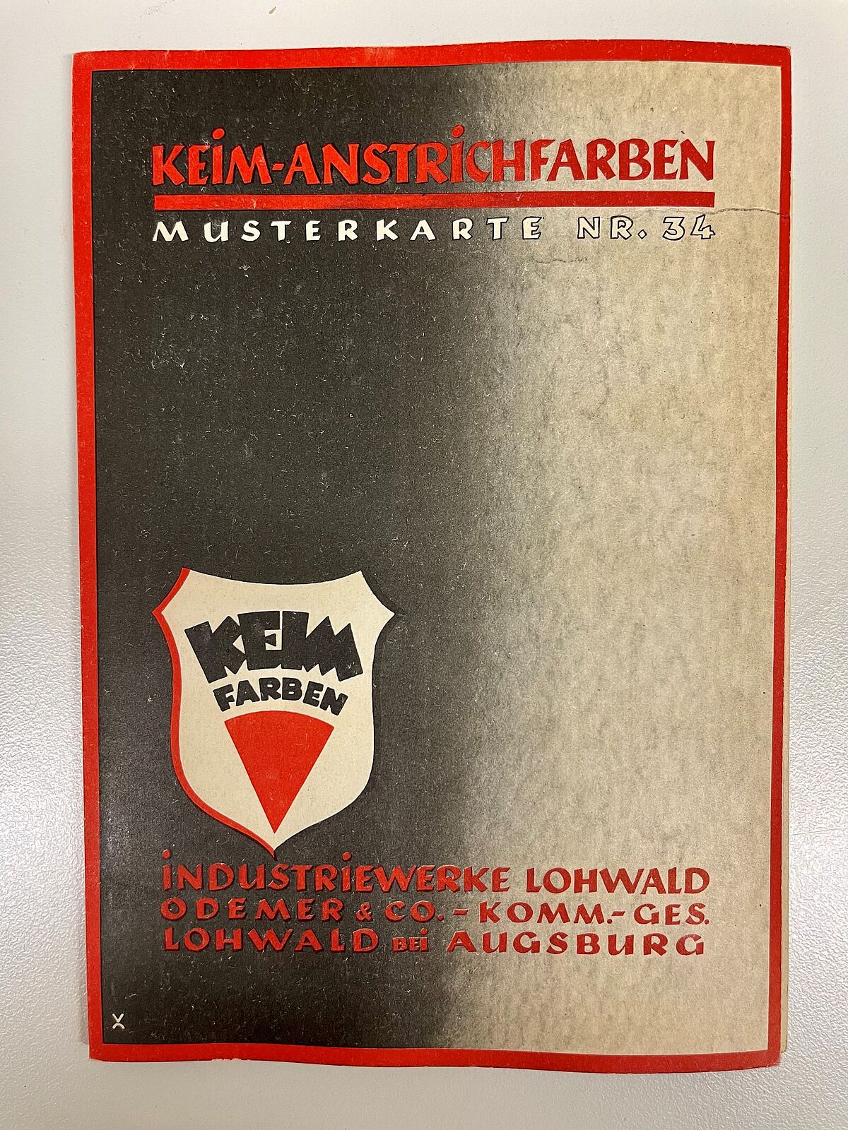
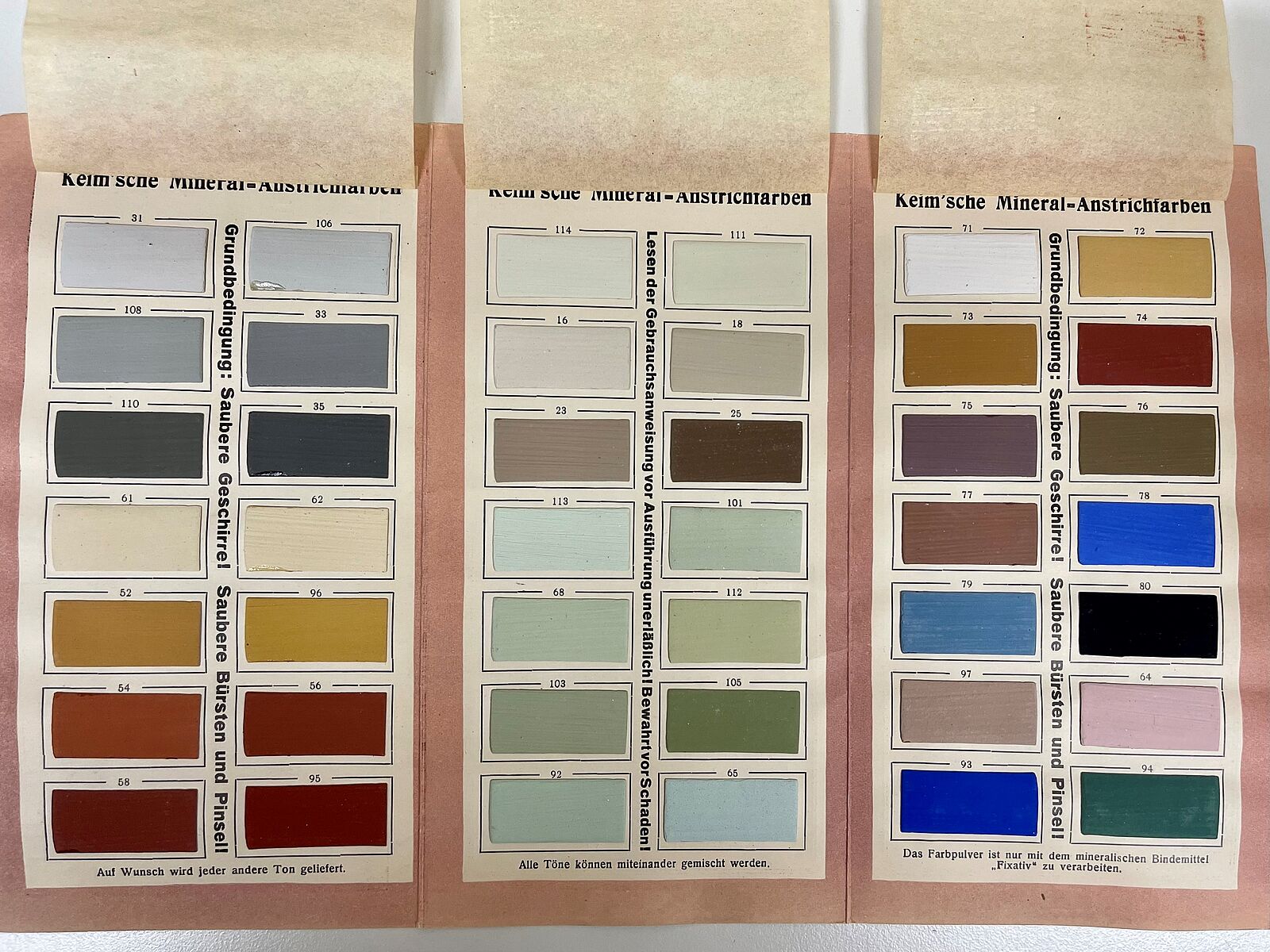
KEIM – when you hear this familiar brand name, you first think of mineral paints and this means the special binding agent used in these painting materials: water glass. It has very special properties in terms of weather resistance and the durability of a paint. But also a property that affects the possible range of colours, because it is alkaline. The colouring pigments must therefore be alkali-resistant, which mainly applies to inorganic synthetic ones such as metal oxides and also naturally occurring pigments such as ocher and terra di sienna. Since KEIM produces its paint materials with these pigments, the result is a very own, characteristic colour palette. The colours in the KEIM colour cards remain stable for a long time and are hardly affected by trends. The colours have their own coding, which does not refer to a common colour system. Mineral paints differ from organic paints because they form a chemical bond with the substrate and do not form a layer on the surface. This affects the intensity and luminosity. KEIM calls it the “crystalline luminosity of mineral paint.” Facades with mineral paints have a high level of brilliance even in less saturated shades and react to daylight and humidity. Mineral paints become part of the building, making them suitable for historic preservation. This special luminosity cannot be represented in a normal colour system.
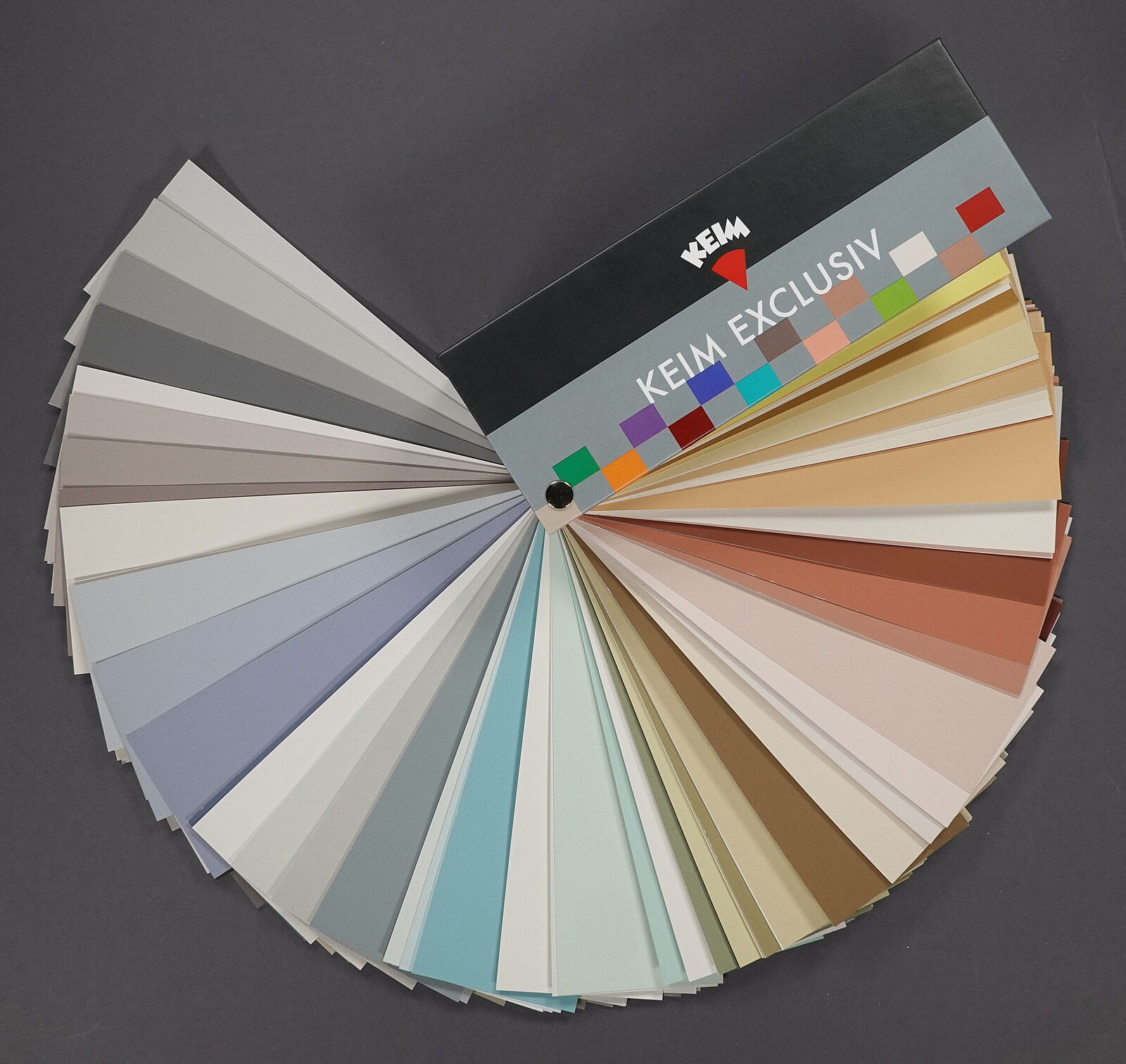
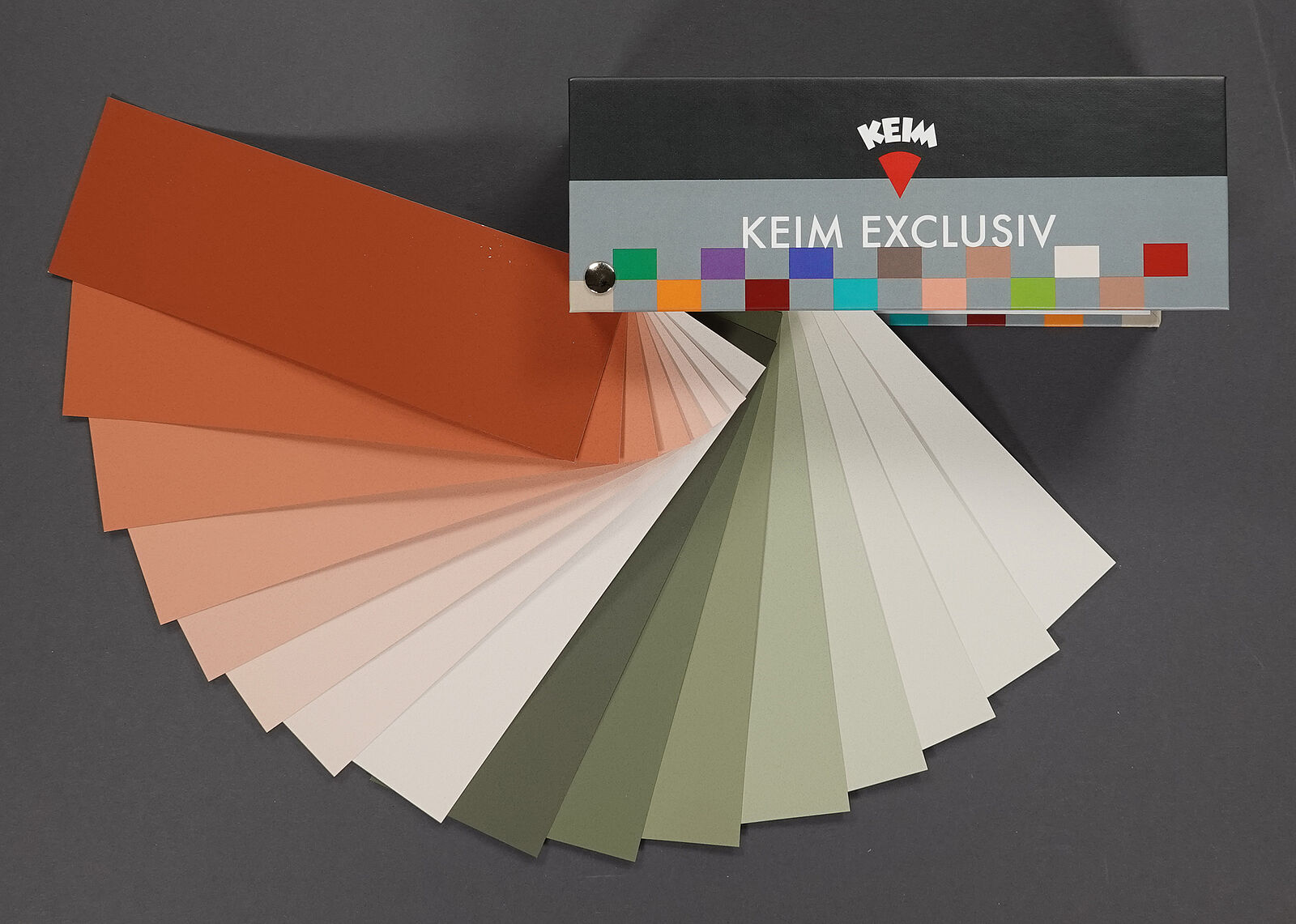
KEIM Exclusiv
The user of the KEIM Exclusive card may therefore not be surprised that the arrangement of the colours in the colour fan follows the colour wheel very randomly. The preceding rich and dark solid tones are followed by yellow and red tones, which are then replaced by yellowish ones, which are followed by green and blue ones. In between, various brownish and gray tones. A dark and intense colour is followed by gradations in brightness. As brightness increases, saturation also decreases in most colour series. The number of gradations is different, sometimes there are 8, for other tones only 3. The visual distances in brightness are approximately the same in some colour series, in others the brightness gradations can differ. From the perspective of the colour designer, it is an advantage to have a larger selection of light tones. Even if the tones appear to be close together on the sides of the colour fan, the effect on the surface can be very different. The big advantage of the fan for architectural design is the selection of colours that are strong, but never overly colourful. The intense solid tones can be used for intensive colour accents.
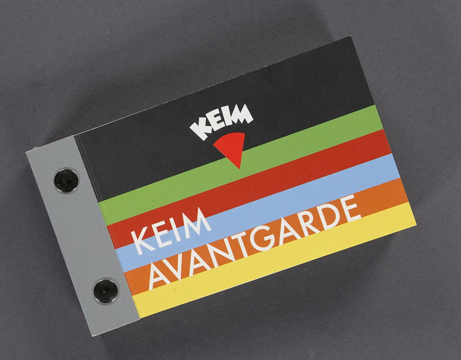
KEIM Avantgarde
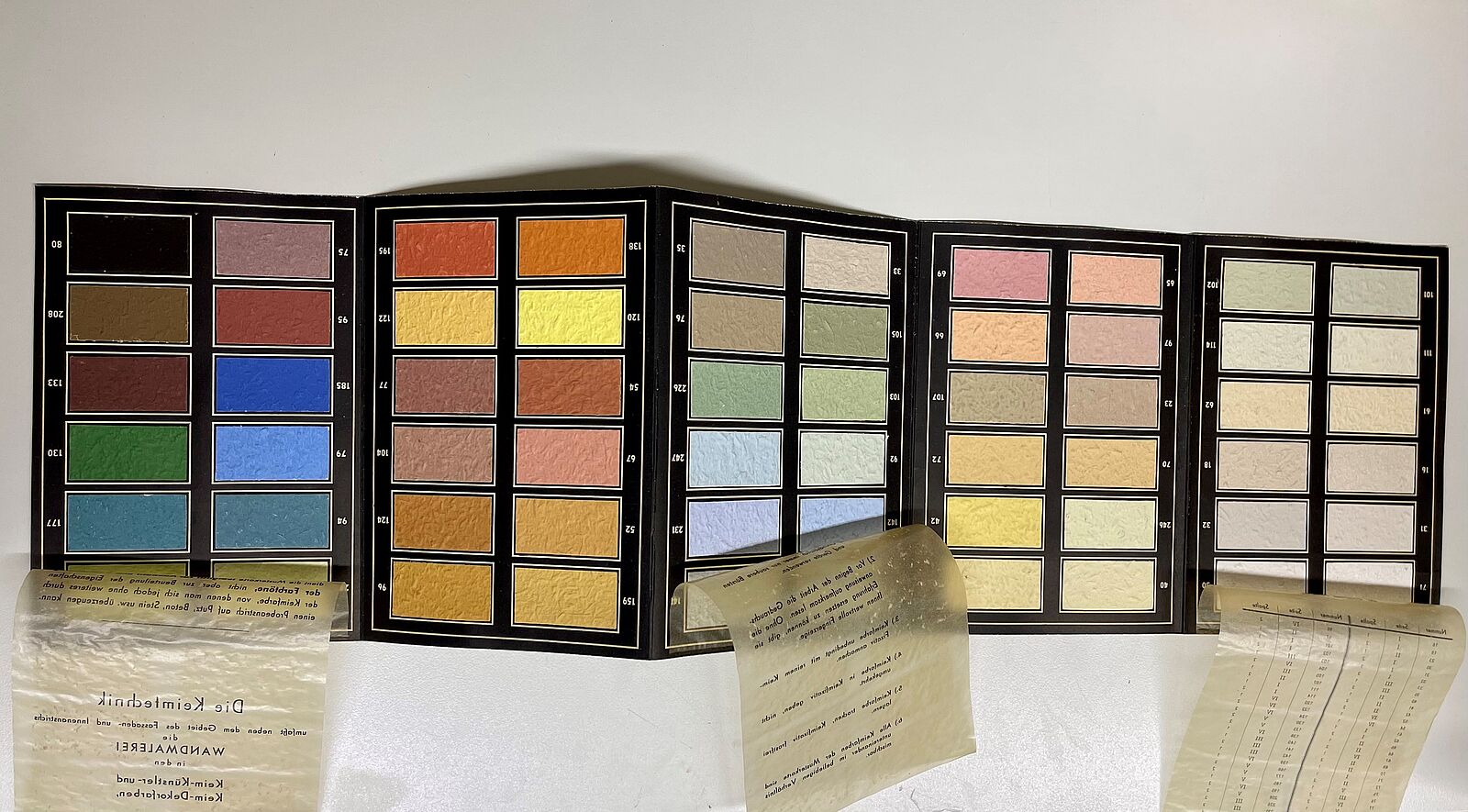
When you hear the name Avantgarde, it may not come to mind, but the KEIM Avantgarde collection has an exciting history. In its current form, it is based on the KEIM colour block from 1928 in terms of format, content and presentation. Essentially, it is one of the oldest KEIM colour cards. In addition to the 68 tones of the colour block from 1928, it also contains the intense monochrome shades as well as gold and silver.
The first KEIM colour block was the result of decades of experience with mineral paints, because it had been shown that these colours are extremely durable on facades. So KEIM decided to bring out a collection of these colours for building design. Especially at a time when building and the type of architecture had fundamentally changed and architects like Bruno Taut used colour in their projects as planned and also implemented it with Keim's mineral colours because only these had the desired intensity and brilliance. It is therefore conceivable that one or another colour tone that Taut used for his buildings was incorporated into the KEIM colour block and can also be found in the avant-garde.
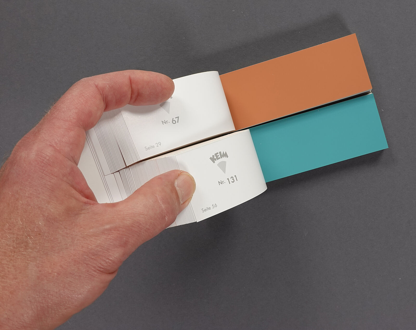
The design aspect of the map is interesting. The colour samples are halved lengthwise, making it possible to see two shades in combination with each other. You can open any colour and let the other colours slide past it like a flip book. In this way you can find very nice colour combinations that you wouldn't have tried if you had planned it out. The avant-garde and exclusive shades are available as individual A4 samples for sampling.
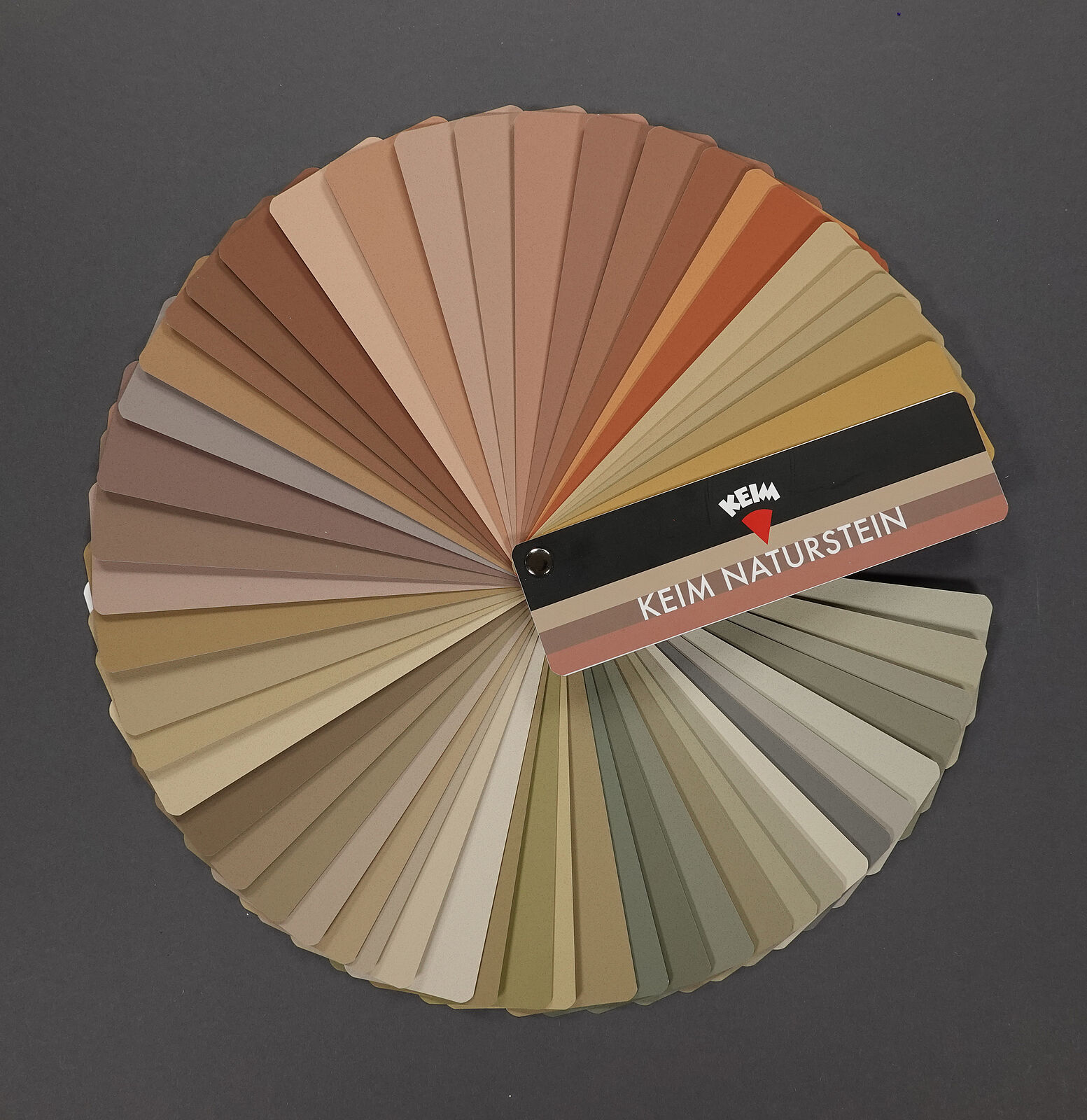
KEIM Naturstein
Natural stone has always been one of the high-quality and durable building materials. They are available in a wide variety of shades, depending on their mineral composition and origin. If you open up the KEIM Natursteinkarte chart, the enormous breadth of the colour palette becomes visible. Almost 60 colours are combined here, which are based on the colours of natural stone from different regions of Germany and were used there for building, e.g. B. Sandstone colours that can range from yellowish to brownish and seemingly violet shades. When viewed up close, natural stones do not have a homogeneous colour, but rather a multitude of different nuances, but when viewed from a distance, these nuances mix to create a uniform colour impression that can be recreated with a paint colour. The colour chart reflects this colour impression. These colours are particularly suitable for the careful restoration or design of facades with natural stone or in their surroundings. The mineral binder naturally rounds off the appearance of the colours perfectly.
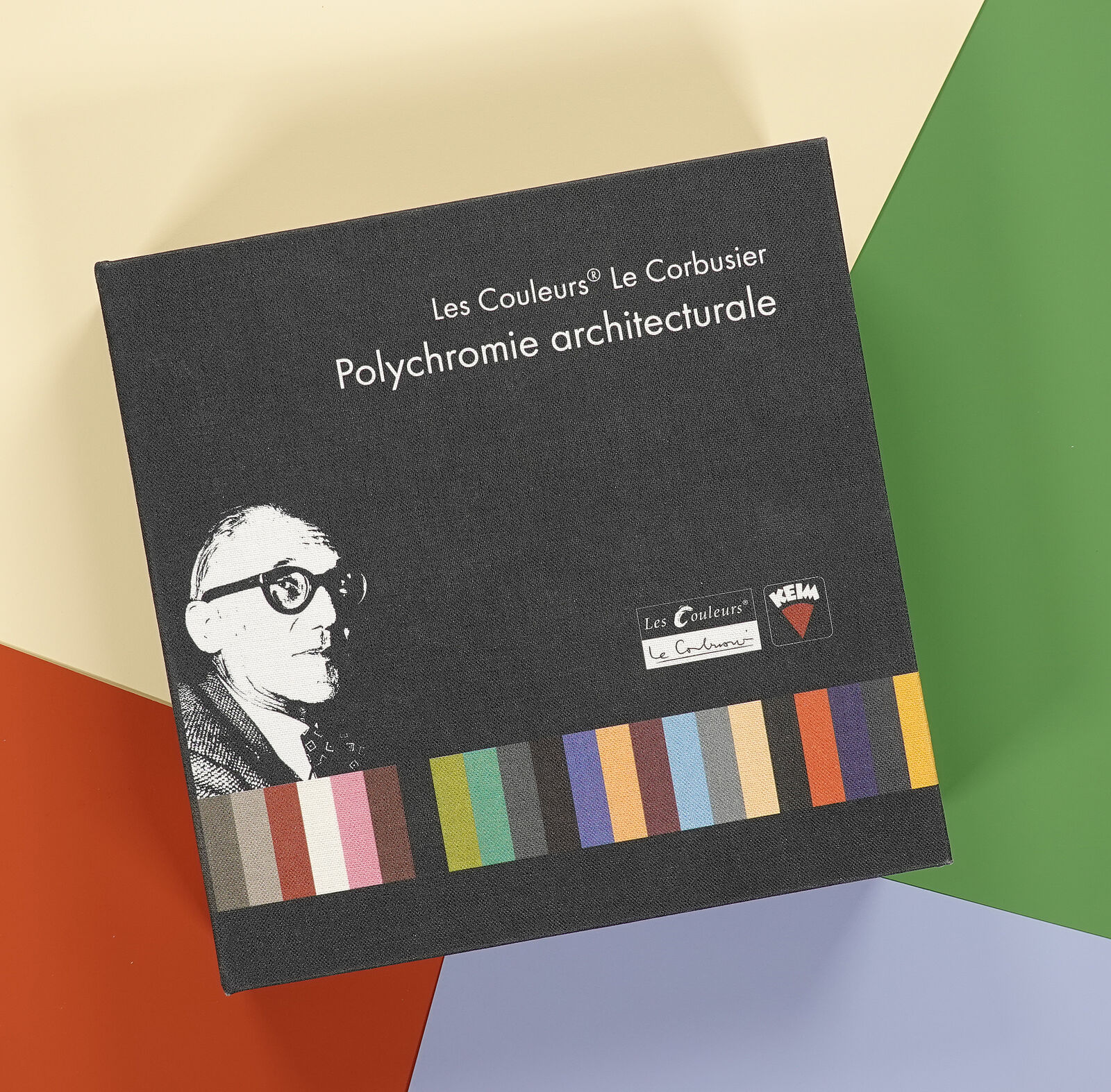
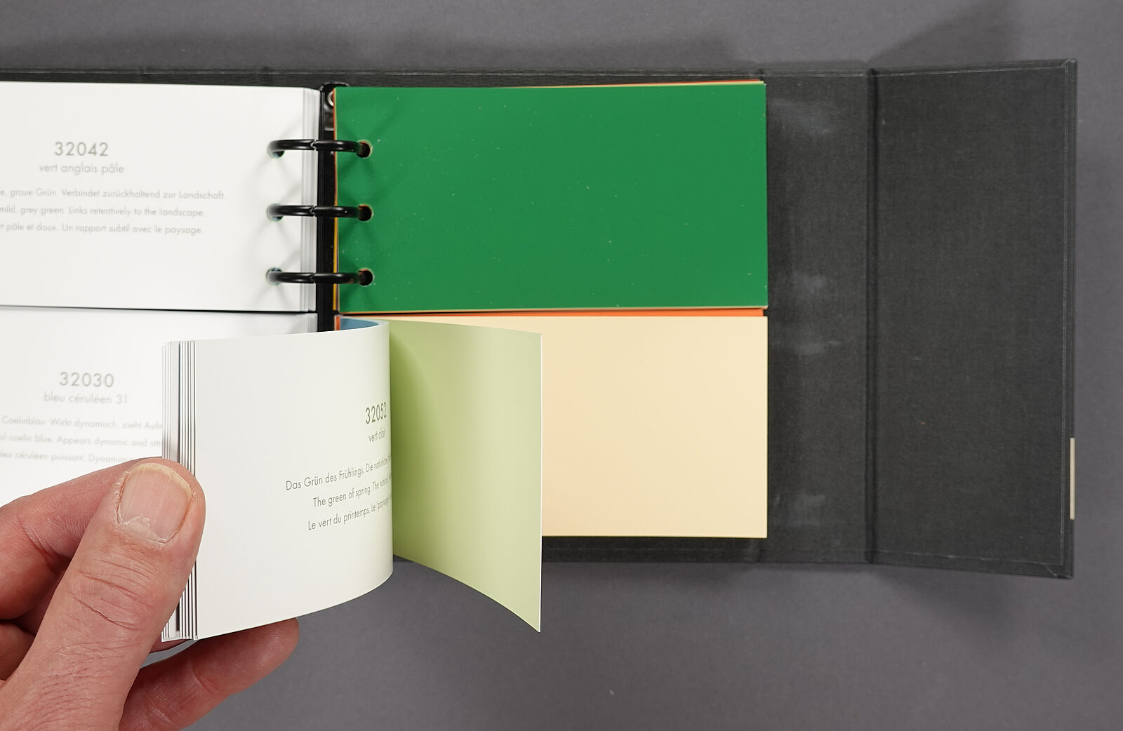
poLyChro® - Le Couleurs® Le Corbusier by KEIM
The Polychromie architecturale colour collection has a similar design intention as the KEIM Avantgarde. The colour samples are halved in a small ring binder so that you can see the tones combined with each other as desired. Thanks to the ring binder, the colour duality can be expanded as desired. This colour collection contains 63 shades that were compiled by Le Corbusier, an outstanding modernist architect, and used in his buildings. He did not follow any system but rather chose the colours subjectively and associatively, also taking into account that all the colours can be harmoniously combined with one another.
Le Corbusier's selection also includes shades that can only be created with organic pigments. For this reason, the colours in this collection are manufactured by KEIM as a separate poLyChro product line with its own recipe, primarily for indoor use.
Colour theory is not everything
KEIM recognizes that the appearance of colours goes beyond the three parameters of hue, saturation, and brightness. Instead, factors such as the substrate, lighting, texture, architectural elements, and surroundings give colours their "life." Colours, much like language, are remarkably multifaceted. This perspective cannot be adequately represented by coordinates in a colour space. Therefore, we do not categorize colours within the usual three-dimensional colour systems. Instead, we provide users with well-established and extensive collections of colours for various design tasks, aiming to inspire them to occasionally set aside colour theory and focus on the complex overall impact of colours in their surroundings.