Hotel Miramonte

Colour treatment for a former spa hotel with Le Corbusier's "Polychromie architecturale" and the new interior paint poLyChro®-intérieur from KEIM.
- Photos:
- KEIM
- Location:
- Bad Gastein, Austria
- Products:
- poLyChro
Attractant colour
When Evelyn and Ike Ikrath, she a hotel manager and passionate hostess, he an architect, acquired the Miramonte in 2008, they deliberately wanted to preserve its brittle 1960s charm: The floors were refurbished, wooden fixtures restored, chairs reupholstered and reupholstered. They were joined by design classics that make every architect's heart beat faster and unique pieces that were designed especially for the hotel. It is this mix of old and new and the generous use of colour that gives the house its unmistakable character.

"The Miramonte is a hotel for free spirits with an interest in design, art and architecture and it is a work in progress," explains Ike Ikrath. "We are constantly discovering new aspects and love change. Colour plays a very important role in this."
Inspired by Le Corbusier's colour keyboards
The poetry and artistic self-image of the Le Corbusier colours are reflected in the redesigned rooms of the Hotel Miramonte. This is also the merit of the colour designer and colour artist Ernst Muthwill from Hallein, who was commissioned with the colour concept.
"The colour is already there anyway, because every person has a very intuitive and correct feeling for the colours that suit them and do them good," Muthwill is convinced of this.
At the on-site appointment at Miramonte, a small team of colour enthusiasts gathered to go through the house together in terms of colours. For Muthwill, the process of finding colours together is the prerequisite for a successful design:
"It's about making the potential of the rooms and the users' attitude to life visible. It is important to me that a colour design suits everyone, because only then is it authentic and only then do rooms transform into living spaces."
Fascinating colour compositions
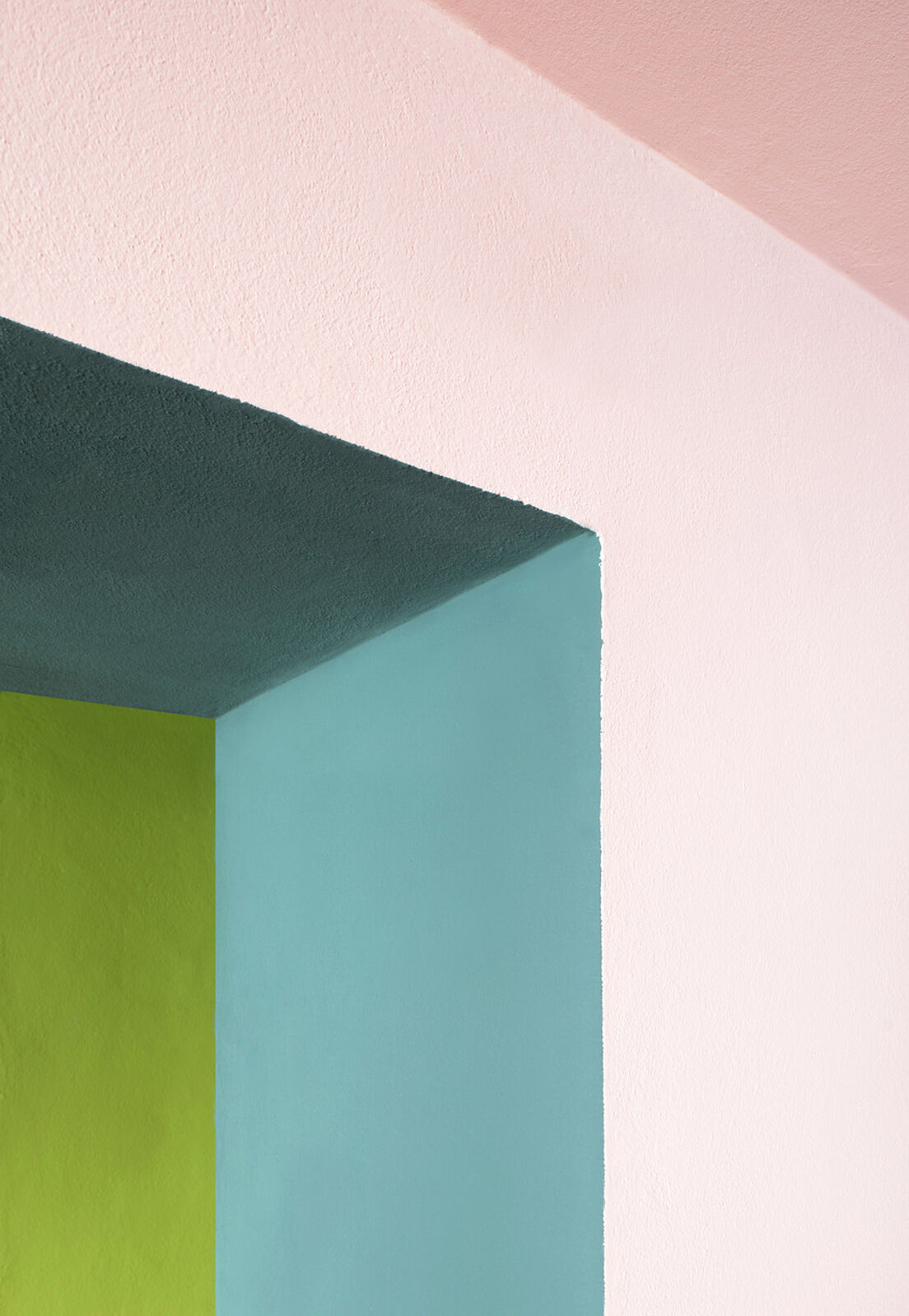
With intuitive certainty, Muthwill used the poLyChro® colour chart to choose delicate, intense and sometimes daring colour compositions because, like Le Corbusier, he is convinced that all shades of polychromy can be harmoniously combined. Through suggestions and objections from the colour team, the design was further developed or changed until everyone involved agreed with all the proposed colours.
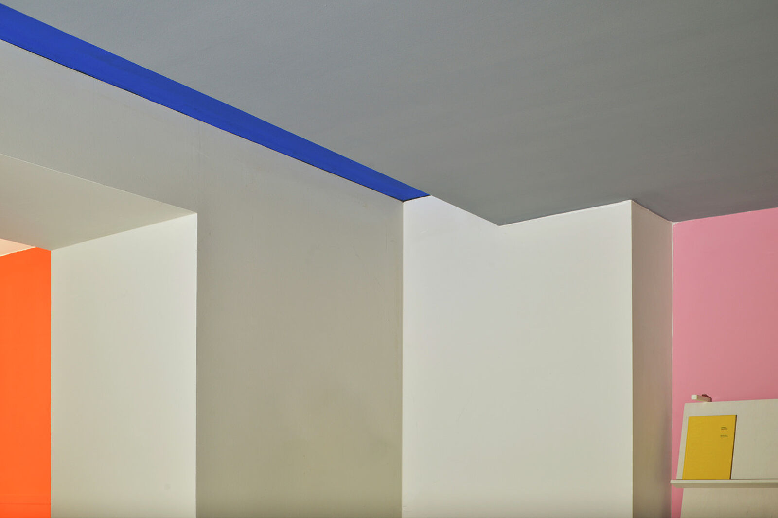
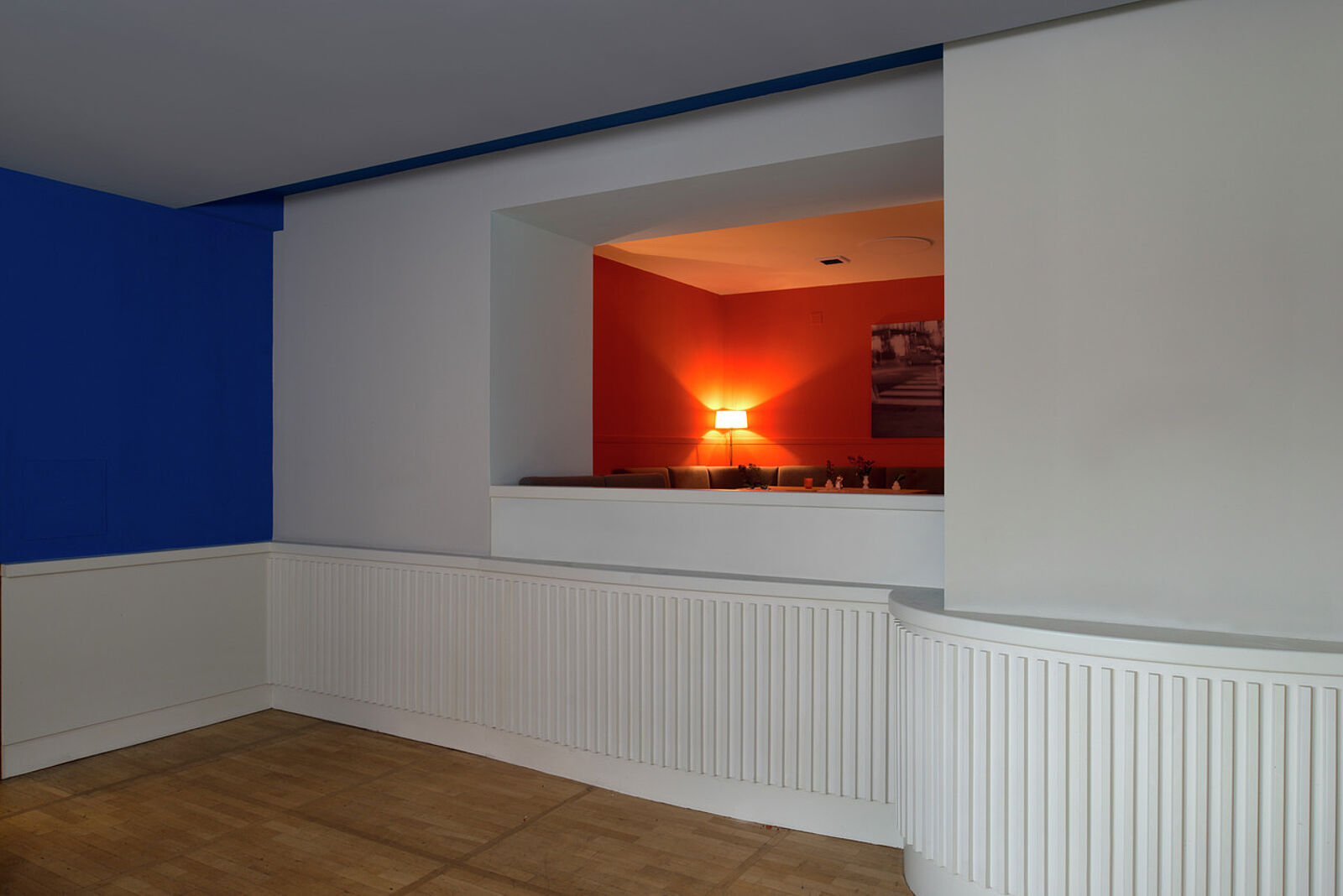
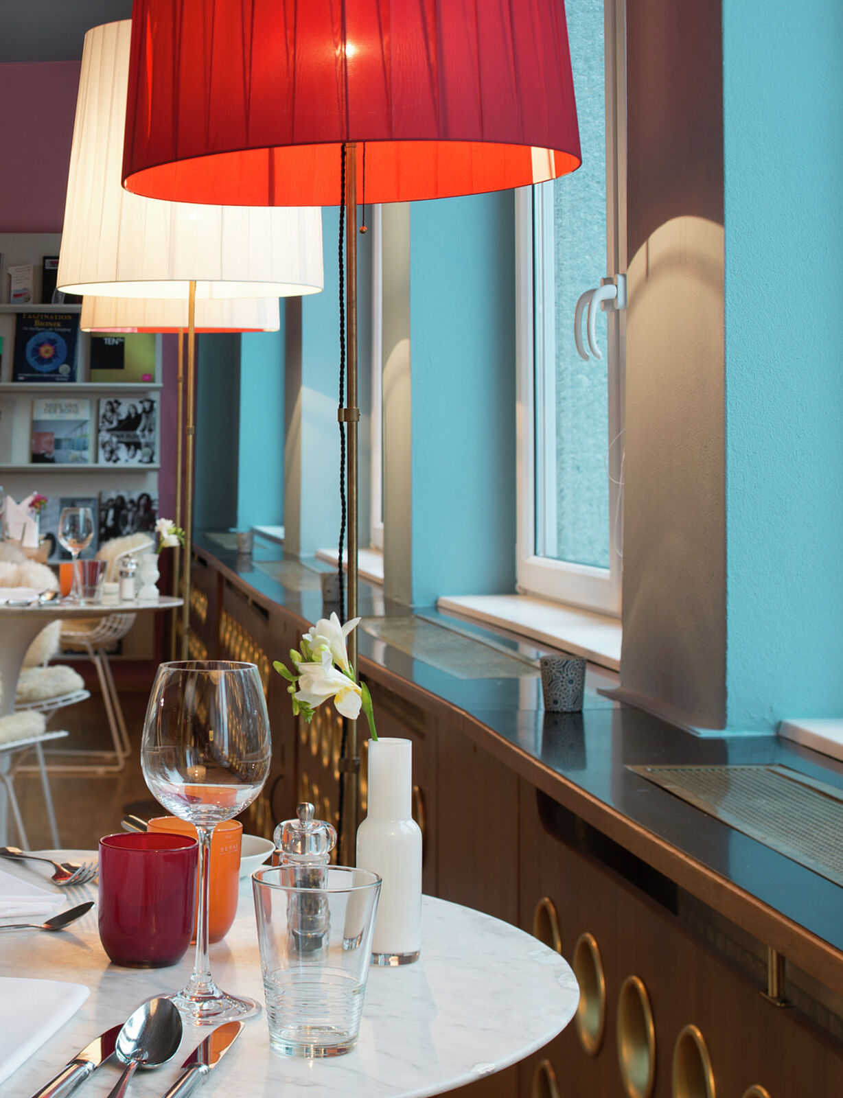
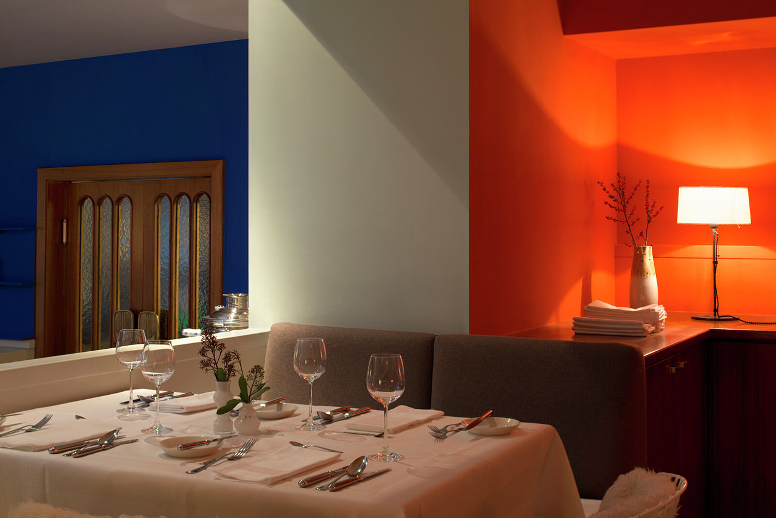
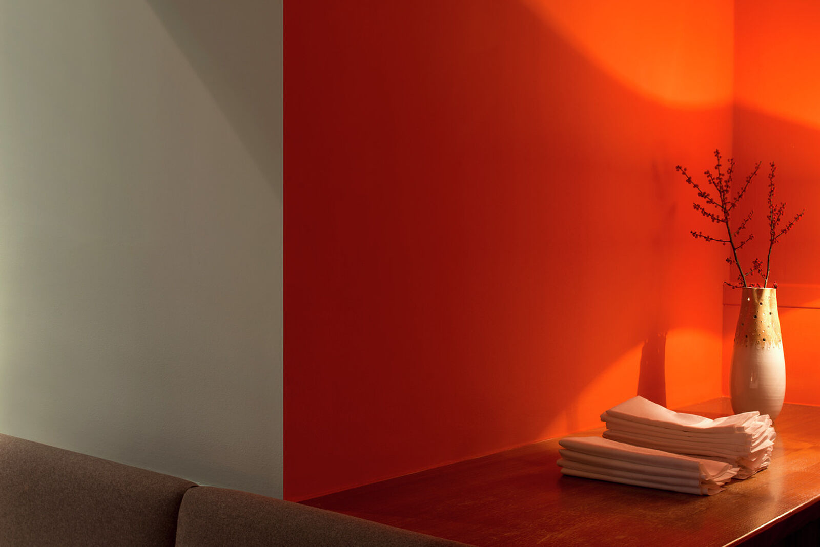
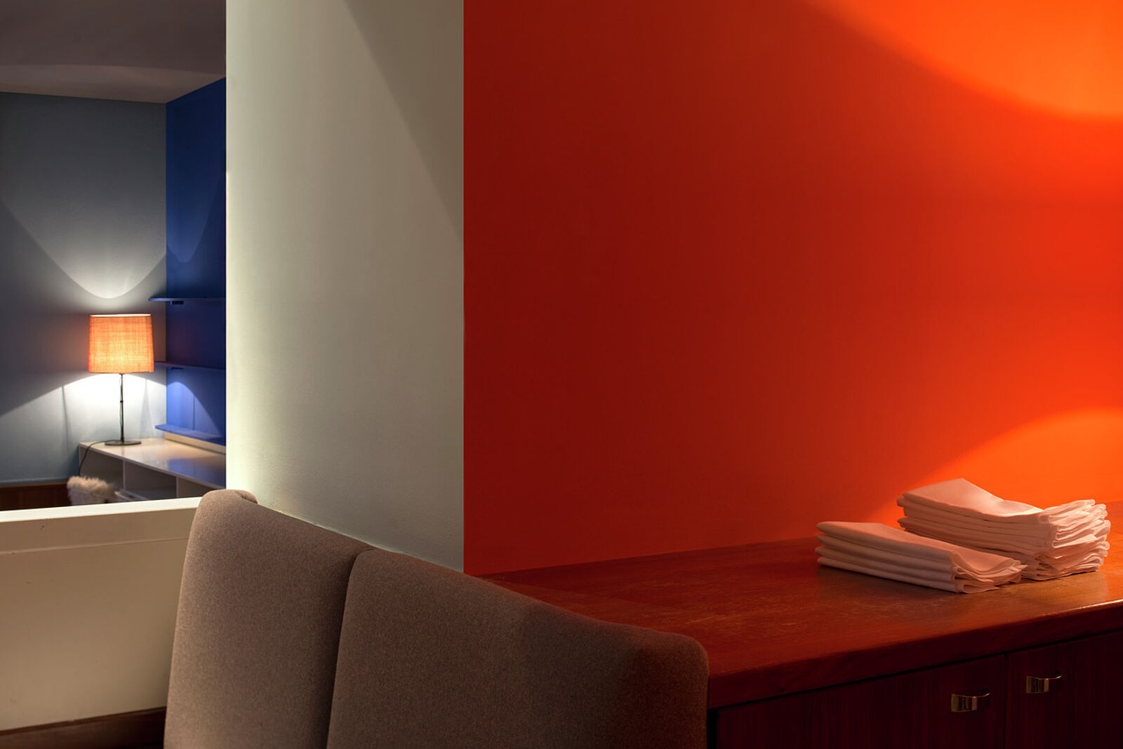
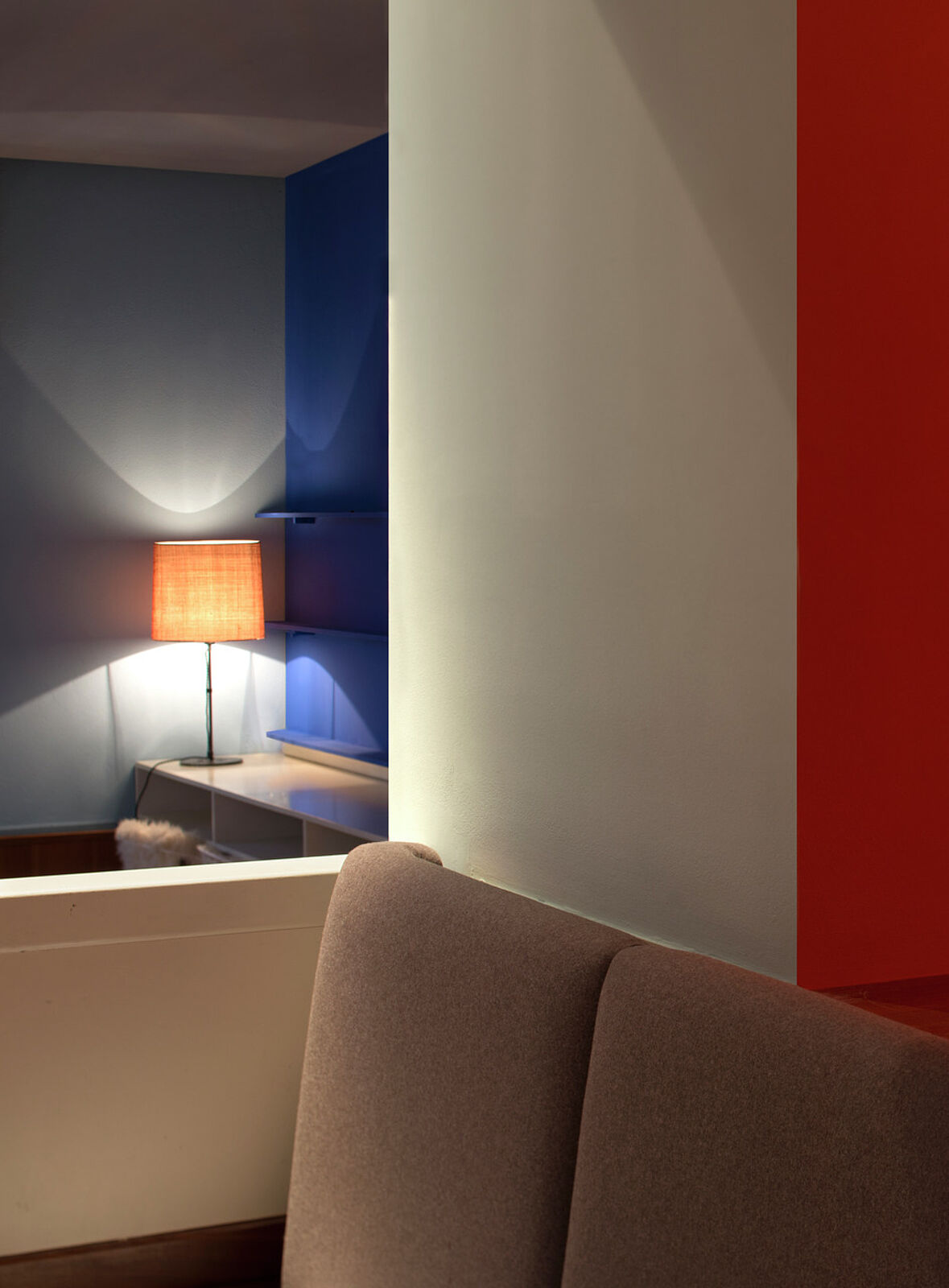
The result is impressive: the blue tones in the entrance bleu outremer foncé, bleu outremer 59 and céruléen vif have an immensely inviting effect, the dining room beckons with warm orange orange vif and pink rose vif, refreshed and stabilised by delicate or bright blue nuances céruléen pâle, céruléen moyen and bleu outremer 59.
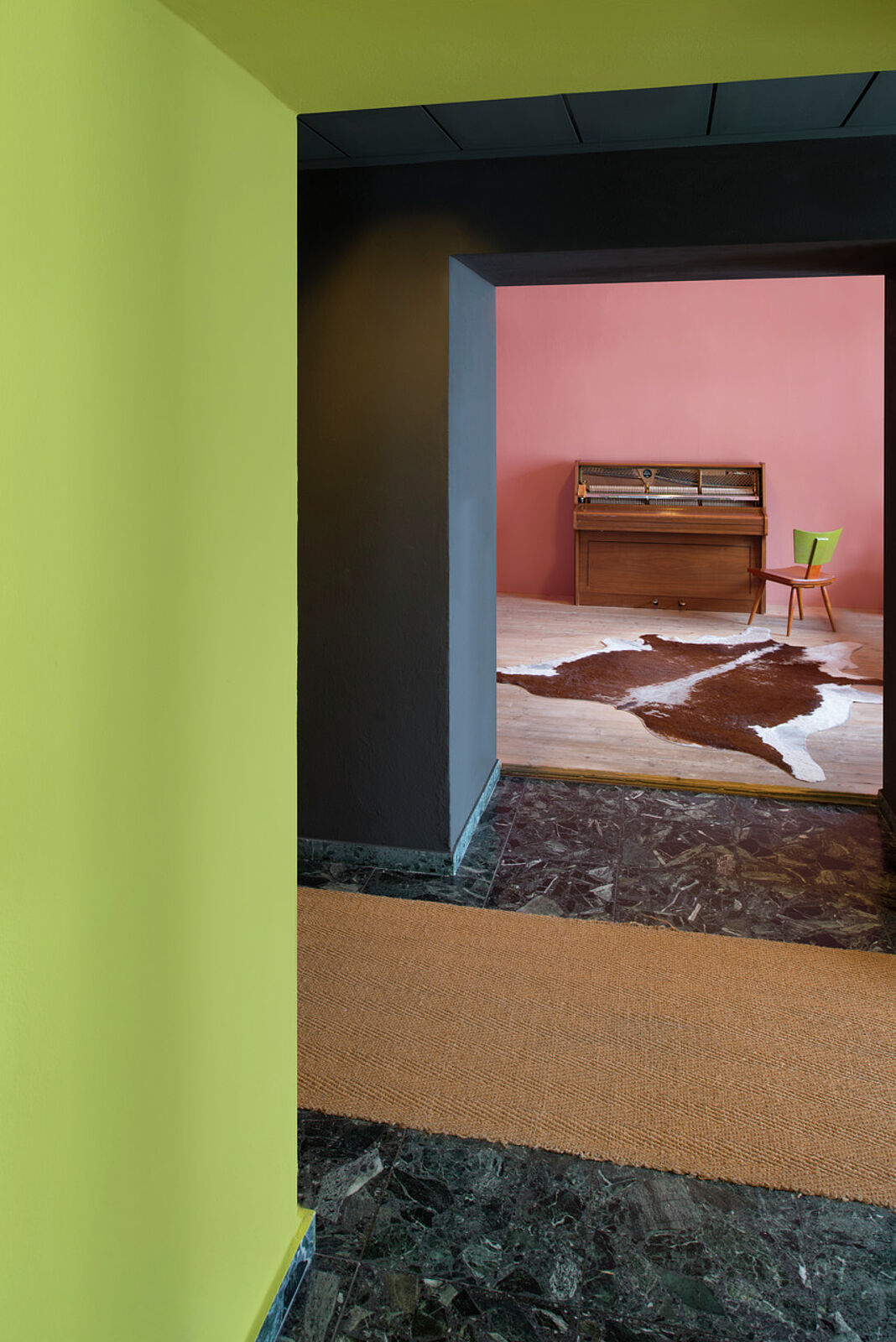
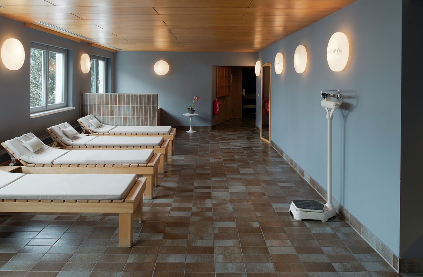
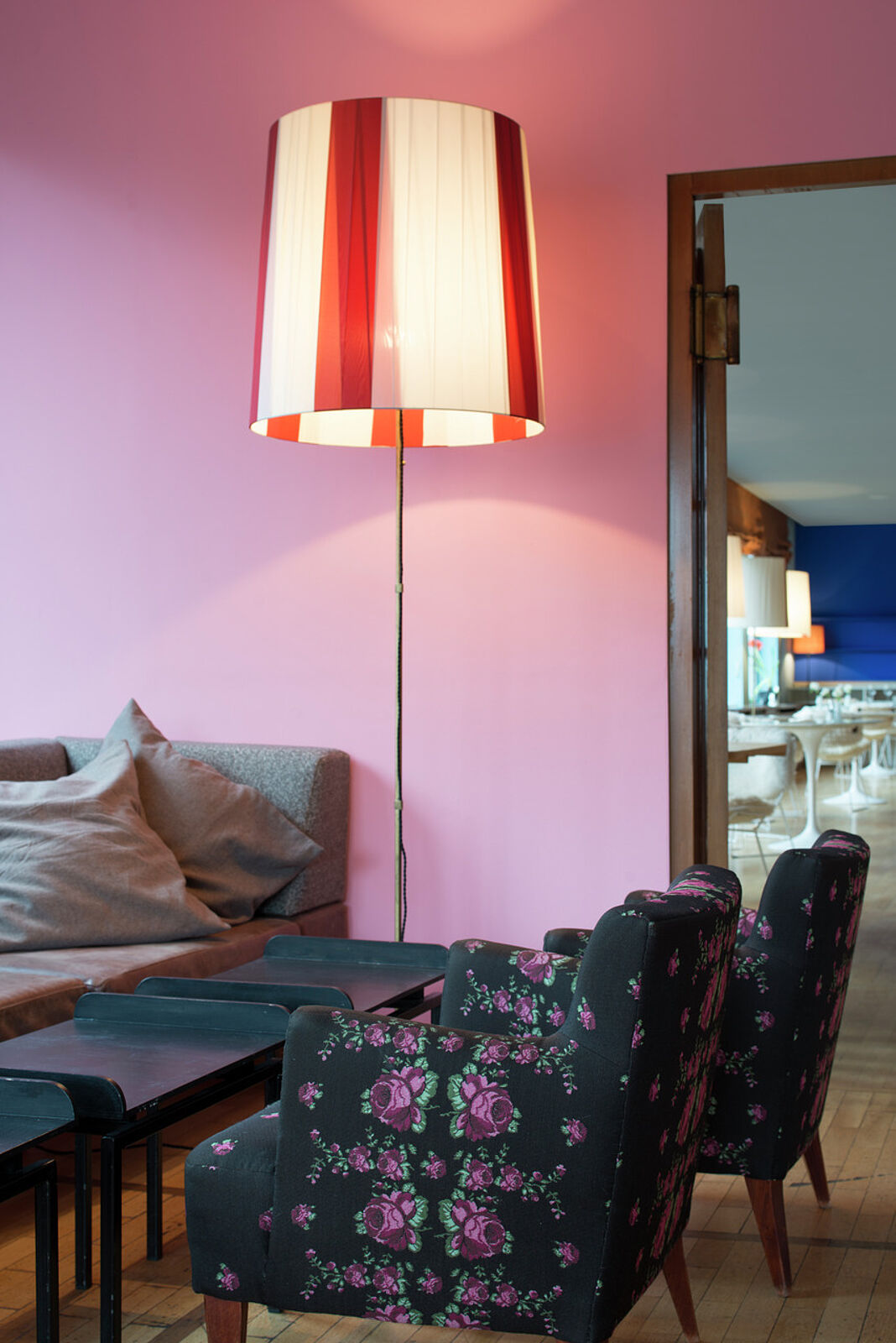
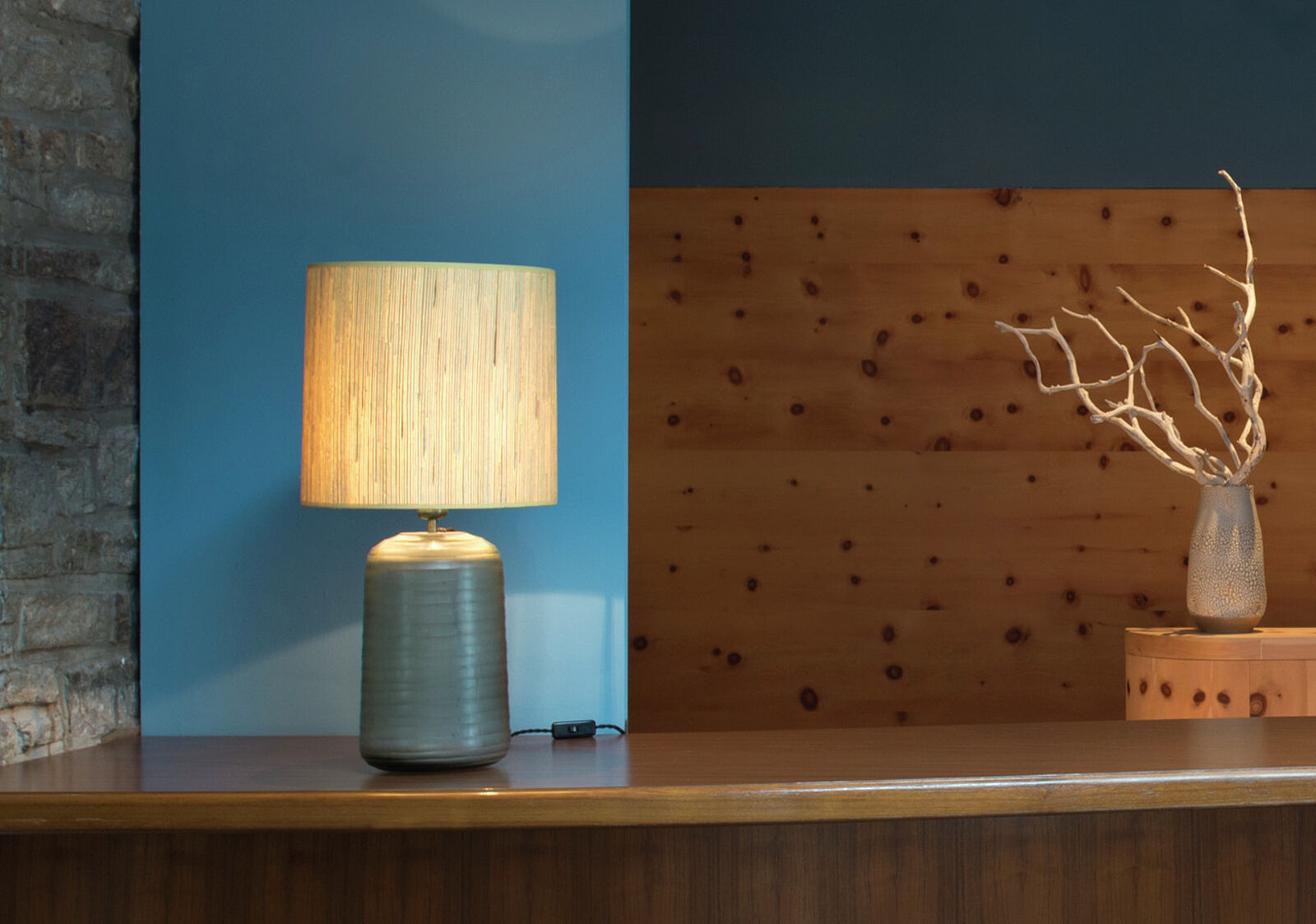
In the bar, a triad of red rouge vermillon 31, ochre ocre jaune claire and pink rose pâle is captivating, and the darker it gets, the more atmospheric it becomes. Warm grey ombre naturelle 59 grounds the composition of soft pink, bright red and strong yellow-green of the coworking space and leads over to the fresh blue-grey of the yoga room. Thus, the path through the house leads through fascinating worlds of colour that give each room its very own mood.
poLyChro®-intérieur
The extraordinary colour strength of the mineral poLyChro®-intérieur paints is due to the high quality of the raw materials and the careful production. The water glass binder used by KEIM is transparent and allows light rays to strike the purest inorganic pigments unhindered, reflecting them crystalline at a specific angle and thus colouring the material. The result is unrivalled depth of colour combined with a velvety matt surface effect. The colour tone becomes the colour body.
It was precisely this architectural approach that was important to the Ikraths: "A precisely defined form, clear contrasts, a coherent structure of the individual parts, a unity of form and colour. We wanted to implement this aspiration of the architect Le Corbusier even more strongly in the Miramonte. And we succeeded, thanks to Ernst Muthwill and poLyChro®-intérieur from KEIM. We enjoy the new colours - they make us happy, inspire, excite - and do so every day anew."

